
The Importance of Proper Color Contrast and the Role of Online Contrast Checkers
Proper color contrast can make or break the effectiveness of a design, influencing its readability, usability, and inclusivity. In this article, we outline the importance of proper color contrast and the indispensable role of online contrast checkers in ensuring accessibility and design excellence.
Accessibility and Inclusivity
We live in a digital world, so that means digital accessibility is imperative. With the prevalence of web-based content and applications, designers must ensure that their creations are accessible to all users, regardless of their abilities. Proper color contrast plays a pivotal role in this endeavor, particularly for individuals with visual impairments or color vision deficiencies.
Consider the implications of poor color contrast on readability. Text that lacks sufficient contrast with its background can be difficult to read, especially for individuals with low vision. This can lead to frustration, exclusion, and ultimately, abandonment of the content or application. By adhering to established contrast guidelines, we can ensure that the text remains legible and accessible to a broader audience.
Proper color contrast enhances usability by facilitating clear delineation between different elements within a design. Whether it’s buttons, icons, or navigation menus, adequate contrast ensures that users can easily identify and interact with these components. In the absence of sufficient contrast, users may struggle to navigate the interface, leading to a poor user experience and potential exit.
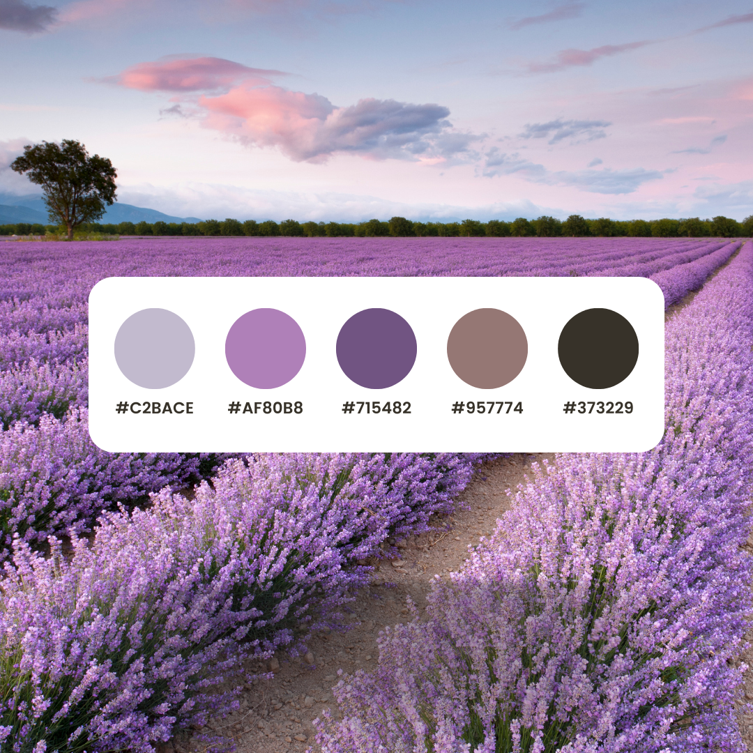
Proper color contrast is important when posting content on social media. By ensuring that the colors used in your post images, reels and stories have sufficient contrast, you are creating content that is more accessible and usable for a wider range of audiences. Online contrast checkers are indispensable tools in this process, allowing designers to create visually compelling and inclusive experiences.
Cognitive Impact
The significance of proper color contrast extends beyond mere accessibility; it also encompasses cognitive impact. Colors evoke emotional responses and convey information, making them powerful tools for communication. However, the effectiveness of this communication hinges on contrast.
Consider the scenario of a data visualization. Charts, graphs, and maps are commonly used to present complex information in a visually digestible format. Without adequate color contrast, these visualizations can become incomprehensible or misleading. Properly contrasting colors ensure that data points are clearly differentiated, enabling viewers to discern patterns, trends, and outliers with ease.
Color contrast can influence the hierarchy and emphasis within a design. By strategically employing contrasting colors, designers can draw attention to key elements, such as headlines, calls to action, or important information. This hierarchical structure aids comprehension and guides the viewer’s gaze through the design, enhancing clarity and communication.

Online Color Contrast Checkers: A Vital Tool
Given the importance of proper color contrast, designers require robust tools to assess and validate their color choices. This is where online contrast checkers emerge as indispensable assets in the designer’s toolkit.
Online contrast checkers analyze the color contrast between text and background elements, providing feedback on the accessibility and readability of the design. These tools typically adhere to established accessibility standards, such as the Web Content Accessibility Guidelines (WCAG), which define minimum contrast ratios for text legibility.
One of the primary benefits of online contrast checkers is their ease of use. Designers can simply input the foreground and background colors they intend to use, and the tool will swiftly evaluate the contrast ratio and provide recommendations. This streamlines the design process, allowing designers to make informed decisions about color usage without the need for extensive manual calculations or guesswork.
Online contrast checkers empower designers to iterate and refine their designs iteratively. By quickly testing various color combinations, designers can identify the optimal contrast ratios that enhance both accessibility and visual appeal. This iterative approach fosters a design process that prioritizes inclusivity without compromising on creativity or aesthetics.
Our favorite Color contrast checker is WebAIM contrast checker.
Conclusion
In the world of design, color serves as a potent means of communication, expression, and engagement. Proper color contrast is not merely a stylistic choice but a foundational principle that underpins accessibility, usability, and cognitive impact.
In the pursuit of design excellence, online contrast checkers emerge as invaluable allies, providing people with the tools they need to ensure that their creations are accessible to all. By leveraging these tools to evaluate and refine color choices, creators can create experiences that are not only visually compelling but also inclusive and empowering for diverse audiences. In a world where design plays an increasingly important role, the importance of proper color contrast is pretty obvious —it is the linchpin that bridges creativity with accessibility, making connections and creating understanding across boundaries.